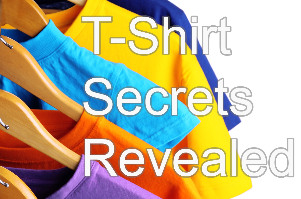
Top 15 T-Shirt Design Secrets Revealed!
T-shirts are one of the most popular items in any store. As the world’s 2nd most popular clothing item, t-shirts are an essential part of every persons wardrobe.
They’re inexpensive, easy to produce and have a wide range of uses. But designing them can be tricky, and with so many different options, how do you know what to choose?
Want to know all the secrets of a good t-shirt design?
In this article we’ll answer this question and more by revealing 15 secrets of successful t-shirt designers.
These secrets will show you how you can make more money from your designs by helping you create something your customers will love.
You’ll will learn how to find inspiration, what fonts work best on t-shirts, and some tricks for making sure your design is readable at small sizes.
These simple steps will help ensure that every shirt you sell is a winner!
What is the right size for my design?
You’ve heard it before: “Beauty is in the eye of the beholder.” But what if you want to make a living designing shirts you need to have some idea what size design will sell best?
The first thing to remember is that there are no magic formulas for predicting which shirts will sell best, but there are some things that correlate with more sales.
For instance, a mid to larger designs sell much better that smaller design. The only exception is a pocket print. Or the rear yoke position, often used for branding.
Pocket or yoke prints can be between 5cm-10cm wide. Mid size chest prints are between 20cm-28cm wide and for large designs, somewhere between 30cm-35cm wide.
Alternatively, you can go for the jumbo size full front designs that are associated with popular fashion brands. The maximum print size is 40cm wide by a maximum of 50cm high.
Make sure you design is legible and readable on a smaller screen – but no so large that the design is unreadable when the user is wearing it.
Contrast
When designing a t-shirt, use colours that pop to create a more recognisable design. By using contrasting colours for the text and the background, it will make the design more interesting.
One of these basic principles is colour theory, which helps you understand how colours interact with each other and what kind of effect they’ll have on your audience.
One way to use colour theory in your designs is by using contrasting colours that “pop”. By understanding this principle, you’ll be able to create more recognisable designs for t-shirts. For example, by using Complementary opposites.
Simplicity
Most t-shirt designers have this problem. Their designs are too complicated and it’s likely killing sales. Answer… Simplify!
There is real science behind why simplicity works better than complexity in designing anything. Keeping the message readable and the image simple will capture the viewers attention.
Typography
Fonts say a whole lot about your design. Script fonts or serif fonts provide a more classic overall feel, whereas, for a more modern look, the sans-serif font might be a better route.
You can experiment with all sorts of crazy and fun fonts to put on a t-shirt, however, you need to ensure they are – above all – readable.
If the words you’re going to have on your t-shirt are vital in communicating the message – you don’t want to overshadow them with loopy, grungy, and swirly typography.
Proportion, Balance and Harmony
When you are designing a t-shirt, it is important to have balance and harmony in your design. A lot of people think that just because they come up with one good idea for the front of the shirt, they will automatically have success.
But if there isn’t any thought put into how this idea is balanced out on the shirt or how it relates to other ideas on different parts of the t-shirt, then what you’ve created may not be as successful as you want it to be.
Emphasis, Focus and Attention
Emphasis, Focus and Attention are three more important factors in t-shirt design.
Focus and attention will be different depending on what type of t-shirt you’re designing (i.e., a concert shirt for bands).
Emphasis is how your design stands out from others; it can be created by contrasting colours or using shapes that stand out.
For example, if you were to use an animal as your subject, like a giraffe with its long neck, then emphasis would come from contrast between the giraffe’s dark spots and the light background.
Emphasis will also depend on whether there is text involved: black text on white paper might seem invisible without some kind of highlight around it to make it pop off the paper.
Movement, Rhythm and Repetition
Designers are always looking for new ways to make a t-shirt designs stand out. If you’ve been designing t-shirts for a while, it might be because of the same old design ideas you keep going back to.
But what if there were better options? What if your current methods have been holding you back from achieving your creative potential?
Movement is one good way that designers can create more interesting and engaging t-shirts. Movement as in motion, as in having something move on the shirt or at least flash by quickly enough so that people notice it.
Motion creates interest and engagement with viewers—it captures attention and makes them want to see where motion will happen next.
Rhythm is another tool that designers can use for better t-shirts. Rhythm is repetition and flow, as in creating a pattern that starts small then grows into something big and comes back down to another small scale.
Both tools can be used separately or together, but they’re both great ways to create visually interesting t-shirts that will engage viewers and make them want to wear your shirt
Other Things To Consider
- Avoid using images that may offend or scare people and images that look like advertisements.
- Keep the design simple and avoid too many images on the front of the shirt.
- Use shapes to make your designs look more interesting.
- Don’t use blurry images or images without contrast for your design – they will not come out well on fabric!
Conclusion
Designers are always looking for new ways to make a t-shirt designs stand out. If you’ve been designing t-shirts for a while, it might be because of the same old design ideas you keep going back to. But what if there were better options?
What if your current methods have been holding you back from achieving your creative potential? Movement is one good way that designers can create more interesting and engaging t-shirts.
Motion creates interest and engagement with viewers—it captures attention and makes them want to see where motion will happen next. Rhythm is another tool that designers can use for better t-shirts.
Both tools can be used separately or together, but they’re both great ways to create visually interesting t-shirts that will engage viewers and make them want to wear your shirt.
Related Posts

Resources For T-Shirt Designers
- Design a t-shirt online as a sample
- Bulk T-Shirt Printing Company
- Get Rough Sketches Redrawn Professionally
- Free T-Shirt Store – Free listing – earn commission
- Drop Shipping T-Shirts – Connect your store
- Build a Website for Selling T-Shirts On
- Buy a Ready-made Drop Shipping Website
- Get help Marketing and Advertising your product
- Learn about T-Shirt Printing Machines
