
T-Shirt Designer: How To Design A T-Shirt People Want To Wear?
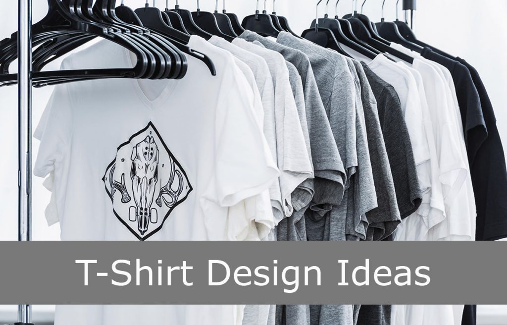
These days you can make a decent-looking t-shirt design in about ninety seconds. Describe it to an AI image tool, pick the best of the four it gives you, tidy the edges, and you’re done.
All this costs less than a cup of coffee, and looks fine.
That is genuinely handy, and it has also quietly wrecked most of the advice we have written about this. Back when artwork was slow and expensive to produce, the artwork was your moat.
It isn’t now. Everyone has the same ninety seconds and the same tools, so all the stuff that used to sit in the footnotes has become the whole job.
This is the updated version of a guide we published years ago. Most of the craft advice in it still stands, and it’s still below. What changed is the order it matters in.
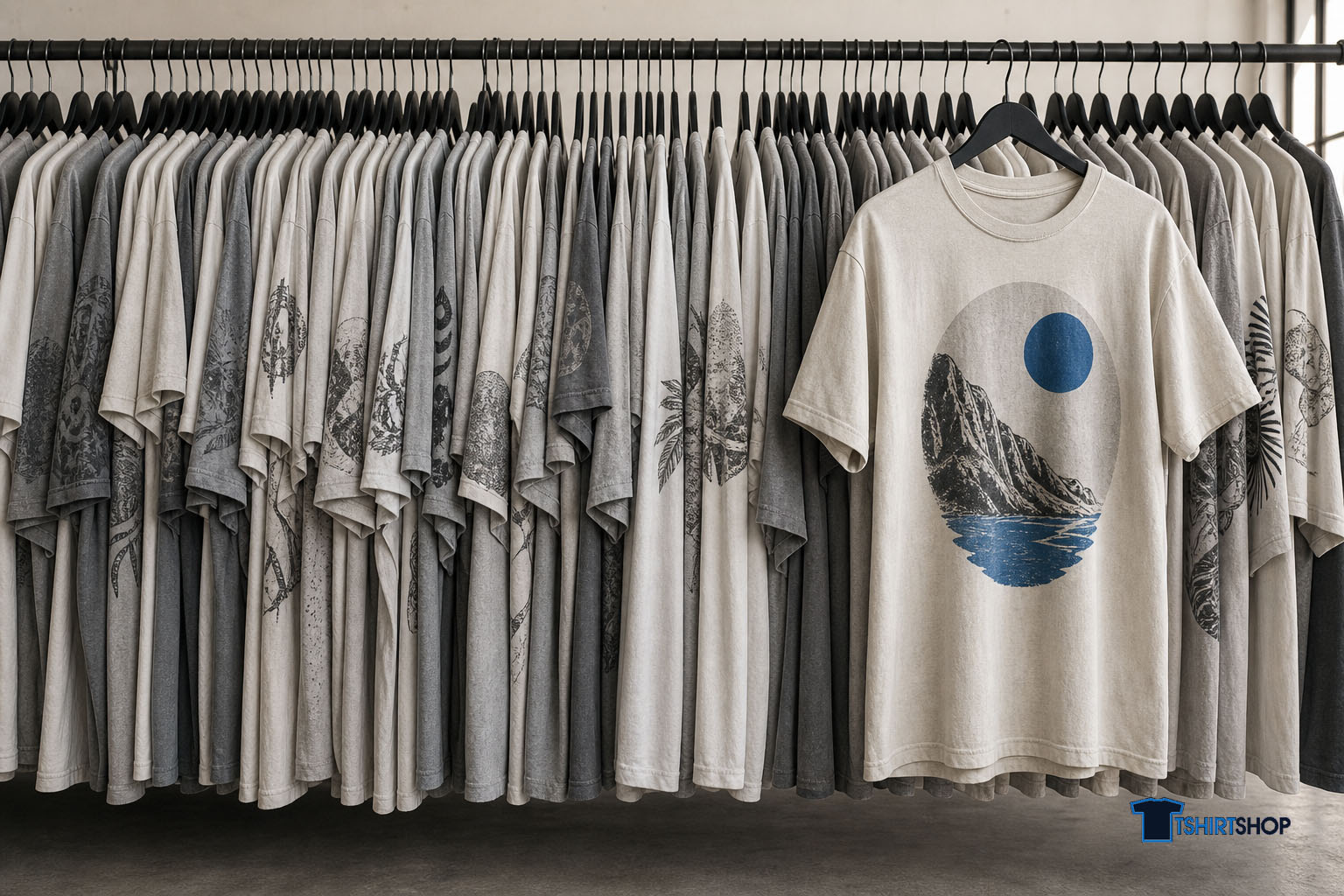
What decides whether a t-shirt sells now
Three things, roughly in this order.
- A specific person. Not “people who like dogs”. Someone you could describe in a sentence, whose reaction to the shirt is “how did they know”. If you can’t name them, the design has nowhere to land.
- Rights you can stand behind. Whether you could stop someone copying your artwork, and whether someone else could have your listing pulled. Both questions have different answers in 2026 than in 2021, and most designers haven’t checked either.
- A file that survives the print. A screen and a cotton tee are different materials with different rules. Loads of designs look sharp in a browser and print like a smudge.
Nail those three and average artwork will still sell. Miss them and beautiful artwork will sit there doing nothing.
Start with the person, not the artwork
There are more than two million active print-on-demand stores worldwide. That number gets used to argue the market is oversaturated, which is the wrong read.
The generic market is no good. “Funny dog shirt” is cooked. Specific is still wide open, because specific is the thing a competitor can’t copy without knowing what you know.
Here’s a test that works. Write down who your shirt is for. If your sentence describes more than about fifty thousand Australians, keep cutting.
- “Cyclists” is too broad.
- “People who commute by bike” is getting there.
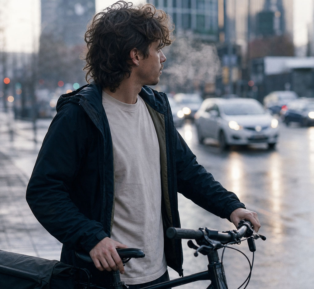
- “People who commute by bike through a Melbourne winter and have strong opinions about drivers” is a shirt.
That third one hands you the joke, the wording and the buyer all at once. Which is what niching really buys you. Not a smaller audience. A shorter distance between the design and the person who sees themselves in it.
The old advice was right that people wear shirts to say something about who they are. It just badly underrated how specific that statement has to be before someone will pay for it.
A shirt that half-describes someone gets a nod. A shirt that describes them exactly gets bought, photographed, and shown to three mates who are also in that niche.
Two decent places to find those niches: a hobby you already have, and the job you already do. Both hand you the vocabulary and the in-jokes that outsiders can’t fake.
If neither applies, spend a fortnight lurking in the relevant subreddit or Facebook group before you draw anything. The phrases people repeat to each other are your design brief.
Using AI without making the same shirt as everyone else
AI tools are a normal part of t-shirt design now, and no marketplace bans them.
What they will hand you, if you’re lazy about it, is the same shirt everyone else made, because everyone is feeding the same models the same adjectives.
Prompt the niche rather than the category. “Vintage retro sunset t-shirt design” gives you exactly what it gave the last ten thousand people who typed it. That commute-cyclist line above gives you something nobody else asked for.
Generate the pieces, not the shirt. Ask for the icon, the texture, the badge shape, the illustration, then assemble and typeset it yourself. Composition is where AI output is weakest, and it’s where your version starts looking deliberate rather than dispensed.
Do the type by hand. Models still mangle letterforms, and even when the text comes out clean, it tends to be a default that a thousand other designs are also wearing. Set it yourself in a real font and the whole thing lifts.
Then look hard at what the model copied. Image tools will cheerfully hand you a character, a logo or a face that belongs to somebody, particularly when your prompt is vague. Anything that feels oddly familiar deserves a second look before it goes near a garment.
And fix the file. Raw AI output usually has soft edges, a background that isn’t truly transparent, and a colour count that’s miserable to print. That cleanup isn’t optional, and it happens to be the part that makes the work yours, which brings us to the bit almost nobody has checked.
Get your rough sketch re-drawn by a professional graphic artist
Do you own what the AI made?
In Australia, copyright needs a human author. Work generated with no substantial human authorship generally gets no copyright protection at all.
Read that again with a seller’s brain switched on. If your best-selling design came straight out of a prompt with nothing of yours added, you may hold no copyright in it. A competitor can lift it, print it, sell it, and you have very little to send them.
If the design came straight out of a prompt with nothing of yours added, you probably don’t own it. Which means nobody has to stop copying it.
The answer isn’t to avoid AI. It’s to be genuinely involved: direct it specifically, curate hard, edit substantially, and combine what it gives you with your own type, layout and arrangement.
Protection attaches to the human contribution, and that contribution is the same work that makes the design distinctive in the first place. The lazy route costs you both at once, which is a bit poetic when you think about it.
Worth saying plainly: this is general information rather than legal advice, and Australian law here is still moving. If a design is carrying real revenue, twenty minutes with an IP lawyer is money well spent.
Pop culture, fan art, and the line to stay behind
The original version of this article said pop culture topics are always good. That has aged badly, and it’s the one thing on this page we’d take back.
The distinction that matters is culture versus property.
Referencing a subculture is fine. So is a shared experience, a genre, a sport, a regional in-joke, the look of a particular decade, a style of humour a fandom recognises.
A character is not fine. Neither is a logo, a band name, a film title, a catchphrase somebody registered, or a recognisable celebrity’s face. Nor are the designs people defend with “it’s obviously a parody”, which is a defence that works right up until it doesn’t.
The reason to care is the penalty structure. Marketplaces don’t just pull the listing. A complaint becomes a strike against your seller account; enough strikes close the shop, and the held balance goes with it.
You’re not risking one design. You’re risking every design you’ve listed and the money you’ve already earned.
So run a trademark check before you list. In Australia that’s the free IP Australia search, plus a quick look at the relevant overseas register if you’re selling internationally. Takes a few minutes and it’s the cheapest insurance in this business.
Pick the print method before you finish the design
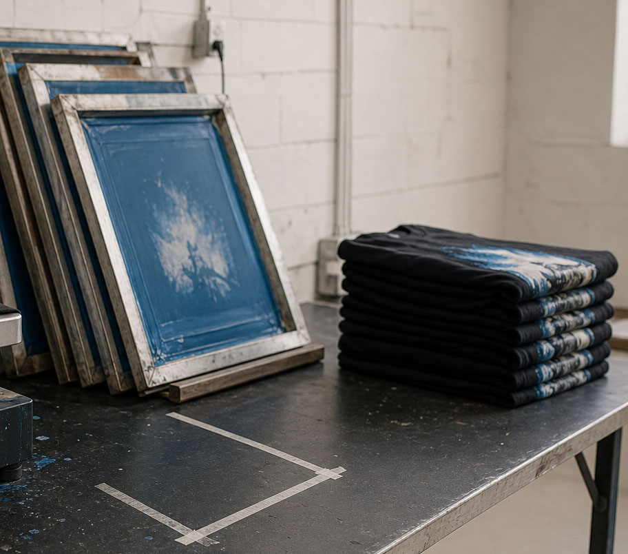
The printing method isn’t something you decide after the artwork is done. It’s a constraint you design inside, and choosing it late is how people end up with a design that can’t be produced at a sane price.
Direct-to-garment (DTG)
Best for runs of one to fifty, full-colour and photographic artwork, and testing new designs. Unlimited colours, gradients and fine detail are all fine. Cost is roughly flat per unit with no setup, so printing a single shirt is viable. Its weak spot is dark garments, where it lands softer and less punchy, and it’s unforgiving of a bad file.
Screen printing
Best for fifty units and up of the same design. Every colour needs its own screen, so colour count drives the price. Setup is expensive, and the per-unit cost after that is very low, which makes it the cheapest option at volume. No good for small runs or for carrying lots of design variants.
Vinyl transfer
Best for names, numbers, small text, and one or two flat colours. Solid colours only, no gradients. Priced per cut, so it makes sense in small numbers. It sits on top of the fabric, which is the wrong look for anything illustrated.
Which one to pick
In practice: if you’re testing designs or selling a wide range in small numbers, DTG is what makes the business model work, which is why it’s what we print with. If you’ve found something that sells and you’re ordering fifty or more of the same shirt, screen printing gets dramatically cheaper per unit, and it’s worth simplifying the artwork down to fewer colours to get there. Vinyl is for lettering and numbers. It isn’t for art.
Designs don’t always move between methods. A twelve-colour photographic illustration is easy on DTG and financially absurd on screens. If you think a design might scale, keep the colour count low from the start and save yourself the redraw.
The file checklist that stops reprints
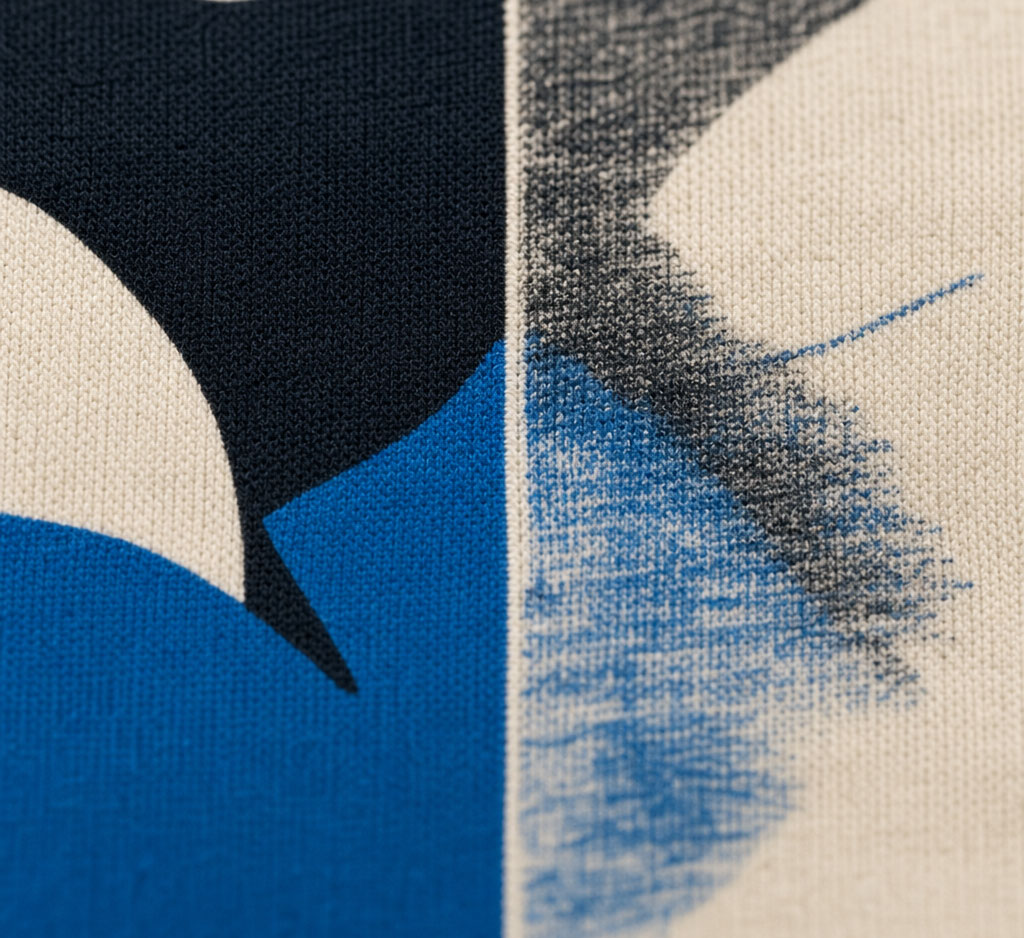
Most print problems are file problems, and every one of these is avoidable.
- 300 DPI at final print size, not at thumbnail size. A crisp 1000px image blown up to 30cm wide is a blurry 85 DPI image.
- Transparent background, genuinely transparent. Not a white rectangle that looks transparent on a white page. Zoom to 400% and check the edges for a halo.
- Print area of roughly 35cm x 40cm for a standard adult front print. Design to it so you know where the physical boundary sits, but don’t feel you have to fill it. Restraint reads as confidence.
- Test it on dark and light. A design with black outlines disappears on a black tee. If your artwork only works on white you’ve cut your range to a quarter of what it could be, so build an alternate colourway.
- Vector wherever you can. Type and flat graphics as vector will scale to any garment size without a rethink. Save raster for artwork that genuinely needs it.
- Watch the thin strokes. Anything under about 1mm at final size is a gamble on cotton. Hairline serifs and delicate line work are the two things that most reliably disappoint in the flesh.
The design rules that still hold
None of the above cancels the craft. This part of the original guide was right, and it still is.
Simplicity wins. Say one thing with the fewest components you can manage. A shirt gets read in about two seconds from three metres away, usually while the wearer is walking past. Busy designs lose that contest every time.
Typography carries more than people expect. Script and serif read classic, sans-serif reads modern, display fonts let you have fun. Whatever you pick has to survive being large and printed on fabric, so avoid thin strokes, tight letter spacing, and anything grungy enough to obscure the words. If the words are the point, don’t let the font fight them.
The basic design principles, translated into shirt terms: proportion means the design suits the garment instead of floating oddly on it. Emphasis means one element is clearly the loudest. Contrast means it reads from across a room. Movement means the eye follows a path rather than bouncing around. That’s honestly all you need from design theory here.
Remember it’s going on a body, and bodies are lumpy and bumpy and every shape going. Flatter, simpler designs cope with that far better than detailed artwork with fine structure that lands somewhere unpredictable.
And match the garment to the wearer. A crop top and a corporate polo are not interchangeable canvases. Work out the garment style and the print placement alongside the artwork, not after it.
Testing a design before you print a single shirt
The old advice was to show it to a neighbour. Better than nothing. Worse than what’s available to you now.
Mock it up on a photo of a real garment, in the colours you’d actually stock, rather than on a flat white rectangle. Most opinions change once the design is on a body.
Show it inside the niche instead of to your friends. Your mate will say it’s great. The Facebook group for your niche will tell you the joke doesn’t land, the terminology is wrong, or that four people already made it. Their reaction is the one with money attached.
Then list it before you stock it. Print-on-demand lets you put a design live and let real buying behaviour answer the question for you. If it sells nothing, you’ve lost nothing. That’s the entire point of POD, and it beats any focus group.
While you’re there, look at what’s already selling in your niche, and more importantly, at what’s missing. Repeated topics and recurring design elements are a trend. Gaps are your opening. You don’t need to be a hundred percent original. You need to add something the existing options don’t have.
Not a designer? Here’s the honest version
You don’t need to be a graphic artist. You do need to be involved. The old buy-versus-make-versus-hire question has collapsed into two real options.
The first is generate and edit. Use AI for the elements, then do the composition, typography and cleanup yourself. Cheapest route, fastest iteration, and enough human input to keep the work yours if you do the editing properly. Most independent designers should start here.
The second is sketch and commission. Rough out your concept on paper, then pay a professional to redraw and refine it. This is the better option when the idea depends on a specific look you can’t get a model to produce, or when a design is already earning and deserves a proper version. A concept beats an execution, which is why your rough sketch plus a good illustrator will out-sell a beautiful design with nothing to say.
Buying pre-made design packs is the one option we’d now steer you away from. You’re paying for artwork that isn’t matched to your niche, that other people also bought, and whose provenance you can’t confirm.
Where to put the designs once they exist
A design that exists and isn’t listed anywhere earns nothing. Shortest path from finished file to first sale:
- Sanity check it. Trademark search, file checklist, mock-up on a real garment.
- List it without holding stock. Register as a vendor, upload your designs, and earn a commission on every sale. We print and ship them. You don’t buy inventory, so a design that flops costs you nothing but the time you spent on it.
- Let the data pick your winners. List several, watch which ones move, then make more in that direction. Your instincts are a hypothesis. Sales are the answer.
- Scale what works. Once a design sells consistently, that’s when screen-printing volume, extra garment colours and paid promotion start to make sense.
Have a look at what other designers are already selling on the store to get a feel for the format. And if you want to see your artwork on a shirt before you commit to anything, run it through the online t-shirt designer first.
Related reading: how to become a t-shirt designer, online tools for your t-shirt business, and the importance of t-shirt fashion design.
The short version
Anyone can produce a nice-looking t-shirt design now, so that part has stopped being worth much. The work is knowing exactly who it’s for, making sure you own it, and building a file that survives the printer. Do those and you’re competing on ground two million generic stores can’t reach.
You’ll need to put in a sufficient amount of effort to research and create; you will end up with something special.
What to do Next?
The next thing you might want to think about is a website to sell your designs on. And a drop shipping service to help you fulfil the order when you get a sale.
Resources For T-Shirt Designers
- Design a t-shirt online as a sample
- Bulk T-Shirt Printing Company
- Get Rough Sketches Redrawn Professionally
- Free T-Shirt Store – Free listing – earn commission
- Drop Shipping T-Shirts – Connect your store
- Build a Website for Selling T-Shirts On
- Buy a Ready-made Drop Shipping Website
- Get help Marketing and Advertising your product
- Learn about T-Shirt Printing Machines
Related Posts